
Designed for SEO friendly webpages
Designed by SEO experts as one of the finest html templates to be used to build a SEO friendly website.
SOON
To Be Available Learn More On
Conversion Features
Designed by SEO experts as one of the finest html templates to be used to build a SEO friendly website.
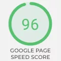
Speed & loading time are critical factors for a SEO friendly html template. That's why the Basic8 template was designed to be fast. No bloatware, simple, blazing fast.
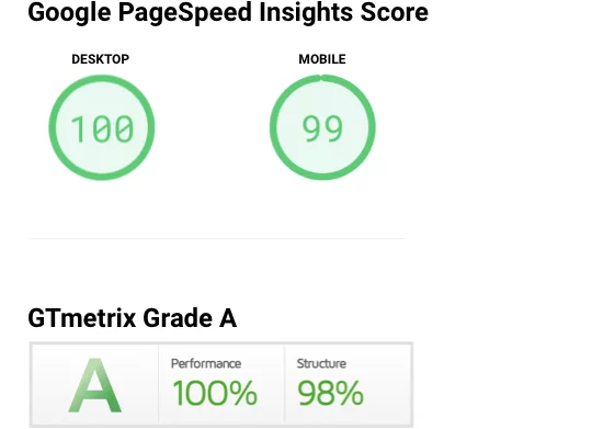
top Google PageSpeed score:2
GTmetrix Grade: A Grade - 100% Performance3
Select a clean, simple to use HTML template designed by web professionals with over 10 years of experience in web & template design, User Experience or Search Engine Marketing & Optimization. Avoid amateurish website templates heavily bloated in UI and styles. While it might be tempting that some offer thousands of designs, templates and UI components, there's a big risk that the overall user experience will be sluggish. This could negatively impact the SEO KPIs of your web pages and ultimately your webpage ranking in search engines such as Google.
The UX experts behind the Basic8 template design, considered from scratch a clean and streamlined user experience, designed for humans, aiming to support SEO strategies such as low bounce rates. Our goal was to build a SEO friendly template that can adapt easily to your SEO strategy.
Users could easily understand and navigate your information structure.
As a simple and easy to read layout, this template supports engagement and encourages users to spend more time on your website.
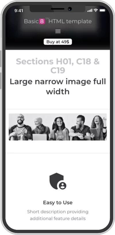
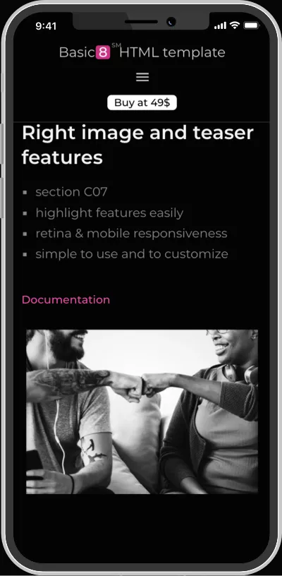
Designed for Mobile, Desktop, Tablet & High Pixel Density Retina Screens

Simply point to your icon files (such a favicon or apple-touch-icon) in the corresponding metatags from the header of your webpage.

The template is based on <!DOCTYPE html> decoration for guiding compliant browsers on properly rendering the webpage.
When we initially started to build this template, we were aiming for XHTML Transitional doctype. Therefore, you will notice that many tags in the html code are coded to support XHTML. However, after further development we realized that it will be easier for most users if we go with a mainstream doctype compliance, so we changed it to <!DOCTYPE html>.
Even so, if you require an XHTML valid template, with minor adaptations you could transform Basic8 template into an XHTML template. Soon we'll provide an example template page optimized as an XHTML template (when available, this will be included in the commercial template pack).
Considering the increased usage of image search, it is important to optimize images for visual search and different viewports. Being able to deliver a different image for a different display resolution will improve the user experience and loading times in various scenarios. This ultimately contributes to the overall UX and SEO friendly strategy of your website.
In most sections that include images, the templates provide a versatile way of specifying dual versions for each image, using the srcset html property. This will allow modern browsers to automatically chose the bigger or smaller version based on the display resolution. For example, a larger image could be rendered wide retina screen.
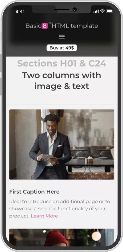
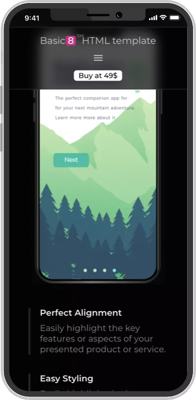
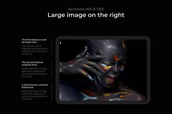
The overall architectural design of the Basic8 template was conceived to enable you to present your information in a delightful flow, section by section.
The UX experts that designed the template went far more than simply designing each section to be both web and mobile responsive. Each individual section was designed having in mind the best practices in UX and usability. And each of our team members has over 10 years of experience in design, usability and driving conversions.
The footer section was designed to support multiple internal links towards categories or individual pages from your website. This could act as a kind of a simple sitemap, guiding crawlers directly from your homepage to those relevant webpages that you want to be crawled faster.
Here's more about our footer design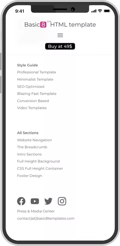
Speed & loading time it is a critical factor for a SEO friendly template.
Find out more about the speed of the Basic8 template and how to test it.
Ranking well in search engines and getting organic visitors from search engines is only the first part of the challenge when building a website. Then, you have to consider various conversion optimization techniques and best practices to convert your visitors into actual users or customers.
Basic8 was created by conversion specialists with over 10 years of experience. It was only natural for this template to be built from the start with conversion fundamentals and best practices in its core design.
Learn more about our converting templateMerely using our template won’t be enough to build a high-ranking web page.
We've put a lot of brain power in the design and coding of this template so that it could support your SEO strategy. But you will need to define and manage your own SEO strategy.
You will need to ensure the quality of your content.
In this context, you can find below a list of search engine optimization tips and tools. These will help you along with your efforts to build a SEO friendly webpage, without the need of hiring a SEO marketing agency or a specialist:
Use heatmap tools (such as Crazy Egg) once your webpage is online. They'll help you understand where your users clicked on your webpage and, as a result, will help you review the effectiveness of your content and CTAs (Call-To-Actions).
https://www.crazyegg.com/
Learn about users' engagement using page navigation path analytics. For example, Google Analytics could help you understand how your visitors navigate your website.
https://analytics.google.com/
Use scroll maps to learn about your users' interest and engagement by understanding how far they've scrolled on your pages.
https://www.hotjar.com/blog/scroll-maps
Experiment with A/B testing by using a tools such as Optimizely or Google Optimize
https://www.optimizely.com/
https://marketingplatform.google.com/about/optimize/